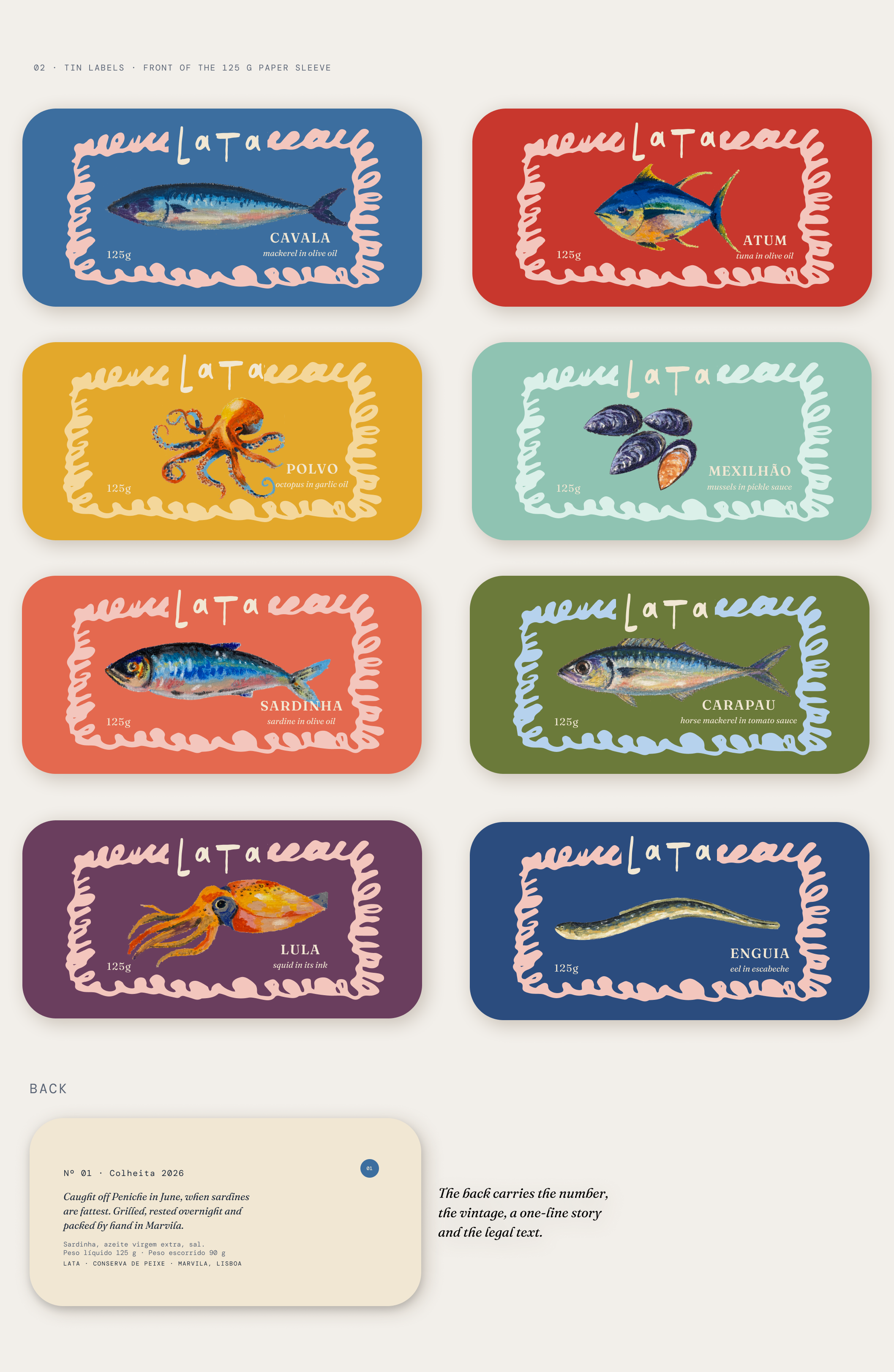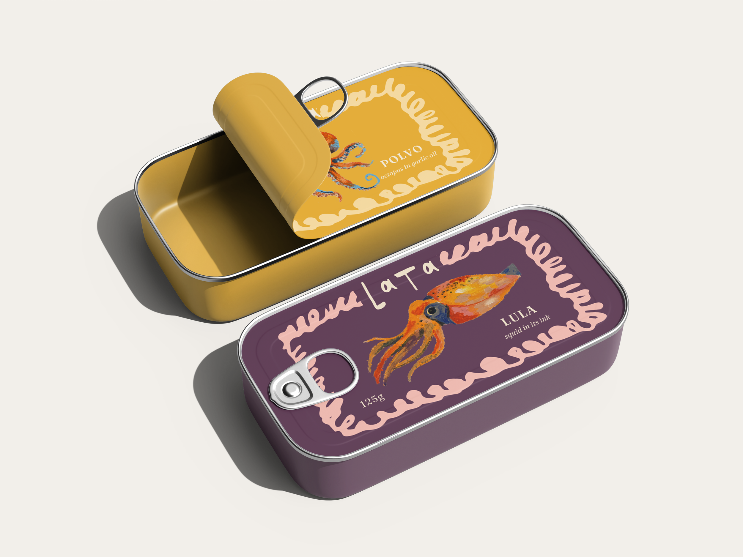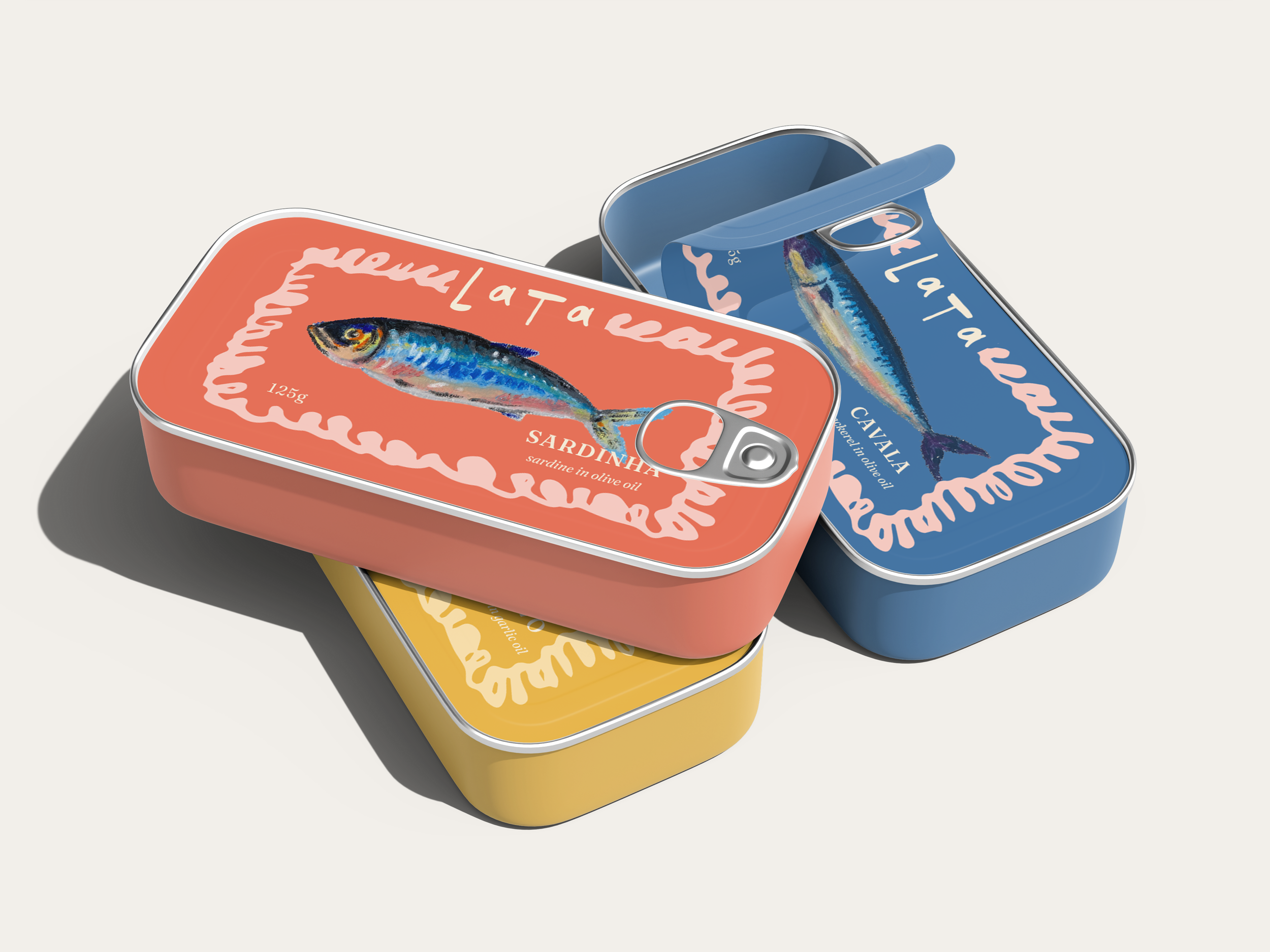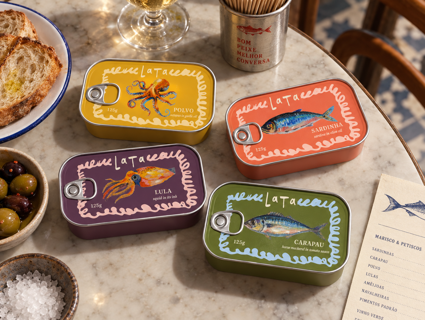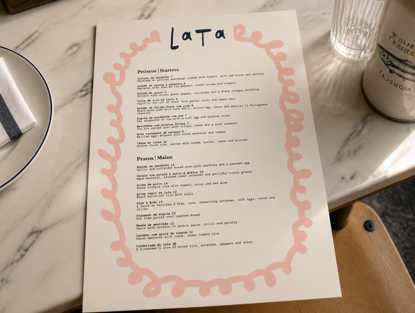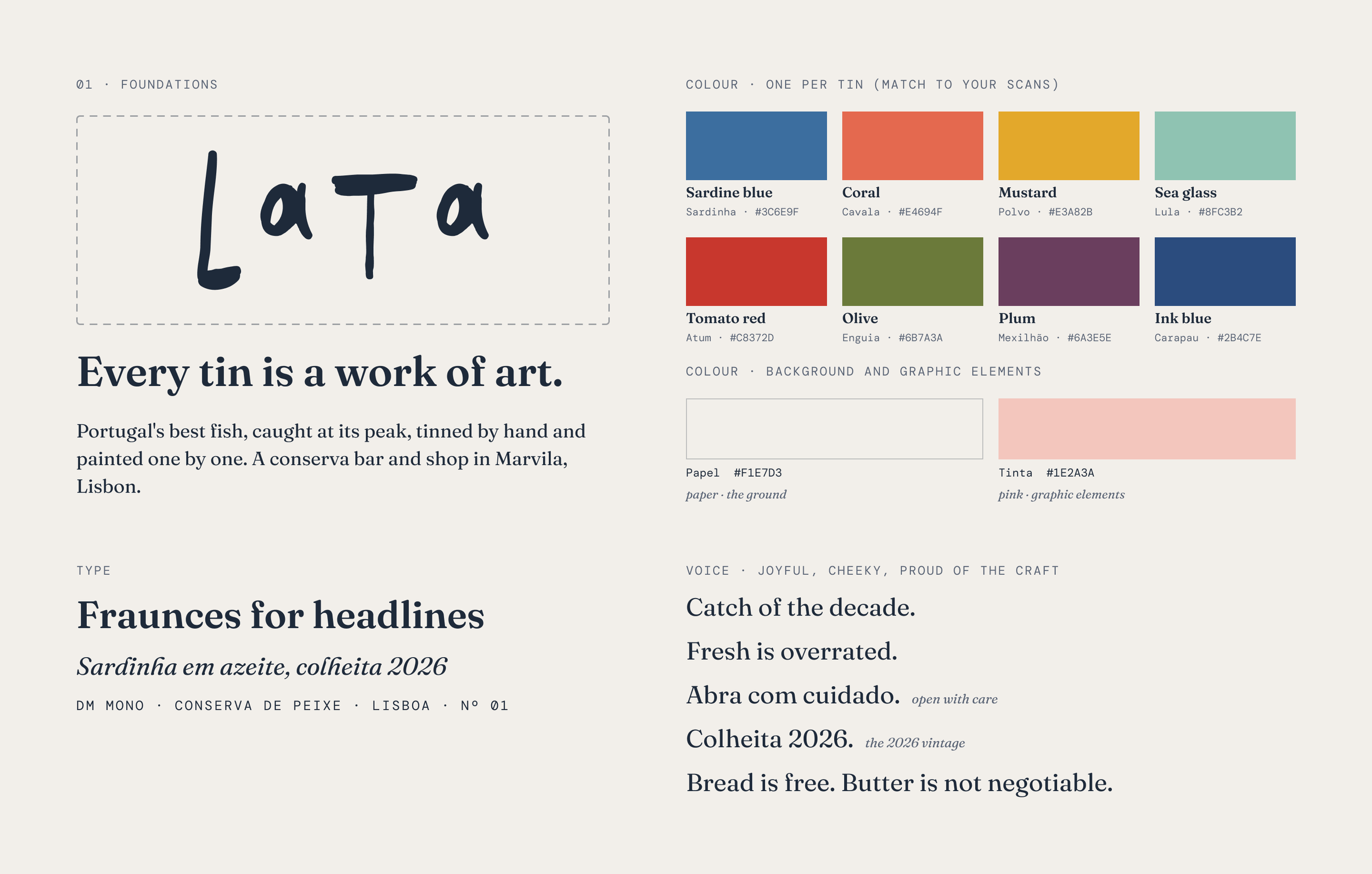
Lata is a brand identity for a tinned-fish bar and shop in Marvila, Lisbon’s old industrial riverside district. The name means “tin” in Portuguese, and the whole identity grows from one idea: every tin is a painting. Portuguese conserva tins have a long tradition of ornate, richly illustrated labels, and I wanted to pay tribute to that by making every label a full oil pastel drawing rather than a simplified graphic. I drew each piece of seafood by hand myself, and there’s a video showing the process below. Where the old labels are busy and crowded, Lata keeps the same richness but frames it in a cleaner, more contemporary layout: each fish sits on a flat block of its own color, such as sardine blue, coral, mustard or sea glass, with simple modern type around it. The result is a modern take on the classic tin can label, carried across the tins, menu and wider brand so the shop’s wall of tins doubles as a gallery.